Tag: Color wheel

Econogal’s Redecorating Tips

Redecorating either a residential property or a business office offers many challenges. Color schemes, style, textures, form and function, and cost all play a role. Interior decorators make these decisions for a living. But if you have an eye for color, a flair for combining things and can stick to a budget, you can meet the challenge yourself.

Budgeting

The first step is the budgeting. Know how much you are willing to spend. My personal preference is to save up for a project. But sometimes repairs or updating necessitate borrowing to complete the project. Of course an important part of the process is knowing how much things cost before you start.

Therefore, I spend a lot of time before I begin a project both online and in stores to determine an average cost. Individuals living in metropolitan areas are fortunate to have competition keep prices down. Rural areas often pay higher prices or have to go out-of-town. Of course this creates an economic leakage from those communities. But I digress.

My rule of thumb on buying is to buy local as often as I can. This might mean paying as much as 15% more. Above that point are some gray areas until you reach the 40% point. I am unwilling to give this much of a premium to a business just because of locale.

Redecorating with Color

After the budget is determined and the funds obtained the fun begins. I start all redecorating projects with a color scheme. The basics of the color wheel are discussed in an earlier blog post Color Wheel Use in Art and Life. Redecorating does add a challenge in the use of color that building from scratch does not have.

This challenge comes in the form of existing components. For example, one project I am currently working on is an office building with beautiful woodwork, red brick and brushed nickel in the interior. The woman’s bathroom is baby pink and the men’s baby blue. The exterior has greened copper roofing, brown and pink paint. All date from about forty years ago.
A similarly aged structure in a nearby town was gutted and rebuilt from the shell, but the cost involved in this type of rebuild are huge. Furthermore, an ongoing business does not have the luxury of shutting down the workflow just to make improvements. Therefore, incorporating the old into the new is imperative.

Fresh paint alone can perk up a space. The trick is finding the right color. The type of company may influence the color choice as can the personalities of not just the employees but also the customers. In some cases an off white or neutral makes sense. Other times call for bold, striking color combinations.

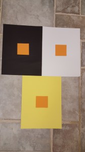
The biggest tip I can give you is to not rely on either paint chips or computer simulations. Find a small piece of drywall and paint it. Then take this sample into the room or building you are redecorating. A two foot square sample is the minimum size I would use.

Sample Size

Carpet, tile, laminate and solid surface large size samples.
Large size samples needed when redecorating.

The same applies to other samples. Once you have narrowed down your selection of carpet, laminate, or solid surface, ask for a larger sample. The tiny chips are tough to read. This holds true for tile as well.

A further step is needed. Go online and search for examples of the product in use. You do not want any surprises. A case in point involves the current tile samples I am considering from Shaw Floors. Shown are samples of the Shaw Marvelous Mix Stainless in 350 Fossil Rock (lower left) and 770 Woodland Park (upper right). Online applications show key differences from the tile samples I have. The Fossil Rock has a very dark tile and the Woodland Park has quite a bit of blue. Yet the samples I have do not show either. The dark tile will blend in with the other materials I am using.  But, the blue would stick out like a sore thumb. In this particular case the decision between the two is easy because of the color not seen on the samples.

Textures Revolutionizing Redecorating

Fortunately, for the above project, metals are making a comeback. The brushed nickel look can blend with either silver or tin. The style you are trying to achieve will determine which you want to use. Tin tends to lend a country look, while silver gives a more formal presentation.

Interior wall with lower quarter stone and remainder raised wood.
Combination of stone and wood wall. Both are three-dimensional.

The metals add texture. But other treatments can extend this three-dimensional look. Stone in particular is making a comeback. One can see applications of stone both on the exterior and the interior. The stone can be combined with other finishes. I like a two item approach because I believe stone can be overpowering. You may not be able to see from the photo but the wood in this picture has varying thicknesses as well as differing widths. I love the combination of stone and wood especially because both are multi-dimensional.

Finally, a balance between form and function is important. An office or home needs to operate, not just look good. But in many cases a utilitarian look that is highly functional can be off-putting to customers. Additionally, a home that looks nice and functions is a home not a showcase. Perhaps in another life I will want a showcase. But for now I need a dual purpose place to live. My redecorating will reflect this balance.

Color Wheel Use in Art and Life

Color Wheel 

My elementary school had an art teacher. Each week the class went to the art room twice for an hour at a time. The art teacher taught us many basic principles. We learned about dimension, texture, line of sight, shading and shadowing, balance and proportion along with many other art elements. But most important, in my opinion, we mastered the color wheel.

Mastery of the concepts put forth by the color wheel is important both in artwork and everyday life. Think about how toddlers dress themselves. Most mix and match with abandon. As adults few can get away with clashing outfits. Homes and workplaces are more pleasant if colors are coordinated. Use of the color wheel can create harmony in our lives.

Basics of the Color Wheel

The primary colors of the color wheel are red, blue and yellow. These three colors combine with each other or with neutral colors to make all known colors. Secondary colors are blends of two of the three colors. These colors are green (yellow and blue) orange (yellow and red) and violet (red and blue.) As kids we used the term purple for violet. The three secondary colors have an equal amount of each pigment.

Tertiary colors are a blend of a primary color with a secondary color. The six colors are yellow-orange, yellow-green, red-orange, red-violet, blue-green and blue-violet. The tertiary colors are placed adjacent to the primary colors on the color wheel.

Values of colors

Value refers to the amount of lightness (or darkness) a color has. This concept is tricky because a color’s surroundings impact its value. The exercise often used in art classes is to use two squares the same color and size surrounded by vastly different colors. The neighboring colors make the squares appear dissimilar. The pictures below illustrate the difference. The orange blocks in the middle are all the same size.

Contrasting three same size orange blocks on black, white and yellow sheets.
The center orange blocks are all the same size.
Orange squares of same size on black and white sheets.
The orange squares appear to be dissimilar in size.
Orange diamonds on black and yellow backgrounds,
Even using to bold backgrounds still creates a difference.

A contrast of color can be achieved by using different values instead of different colors. Thus a monochromatic color scheme (using just one color) can create depth and contrast. One of my favorite artist’s is Quang Ho. In his painting Harmony in Whites, he creates a beautiful stallion. Although there are a few bits of color in the horse tack and some shadowing, the overall impression is one of a white stallion in a white background. Thus a monochromatic color scheme. Yet the horse pops out of the painting as if he is in the room. Both depth and contrast are evident as you can see in the photo.

Warm and Cool Colors

The color wheel divides into warm and cool colors. Yellow and violet are the dividers. The reds stretching from red-violet to yellow-orange are the warm colors. The cool colors are opposite on the wheel and are found from yellow-green to blue-violet. The acrylic painting depicted below is one of cool blue tones with a splash of red for contrast. The warmth of the red adds a spark to the artwork. In the quilt Sophie the Cat is admiring, the overall tone is warm. Again there is some contrast provided with the addition of a cool color.

An abstract painting in blues with a splash of red accent.
Cool colors
A striped cat with a quilt featuring warm orange tones.
Sophie the Cat with a warm quilt.

Color Schemes

In both cases, the tone of the contrasting color was important. This is where the color wheel becomes so useful. Knowledge of how the colors combine is critical. Colors directly opposite one another on the wheel are considered complementary colors even though they are contrasting. For example red and green are complementary; think Christmas. The contrasting colors harmonize. However, in some applications complementary colors are difficult for the eye to process. You would not want books of blue pages and orange ink, even if you are a Florida Gator fan.

Analogous colors are colors that are adjacent on the color wheel. Yellow-orange, orange and red-orange are analogous. This blending of colors can be very soothing to the eye but care must be taken so the result is not boring. On the other hand, contrasting between two sets of analogous colors can be quite pleasing to the eye.

Monochromatic schemes are based on one color altered by tints or shades. Tints are created by adding varying amounts of white. Shades are achieved by adding differing quantities of black. Greying occurs by mixing two contrasting colors together. Thus Easter eggs dipped in all the colors becomes a muddied grey/brown depending on the dye colors.

Resources of Color Theory

Unfortunately, many schools today no longer have art teachers and so the task of teaching art falls on the classroom teacher. Time spent on art is also limited so that often the time spent on art is geared toward creativity. Kids need to have creative expression. However, the time constraint can mean art theory is not covered as thoroughly as in the past. Thus, only students who pursue an art education may fully understand the many nuances of the color wheel.

Fortunately there are many sources available for the motivated self-learner. One of my favorite books is a color workbook for quilters. Color and Cloth by Mary Coyne Penders does go beyond the color wheel to include textures and scales. But there is an abundance of color theory. This is a great book for quilters even if they are confident in there color selection.

Another book I own is Color: A Stroke of Brilliance by Leslie Harrington with Joan Mackie. This paperback published by Benjamin Moore Paints is geared toward use of color for interior designs. This has the basics of color wheel theory and has many sections of questions and answers. I refer to this book frequently when working on interiors in commercial locations as well as in my own home.

Finally, in this age of internet, I like several websites. For color theory, visit Tigercolor which does a nice job covering the basics with an option of purchasing ColorImpact. Another site I like and use is Benjamin Moore. I use their Personal Color Viewer when I am working on projects. Simply upload a photo of the room and then follow the instructions to see how color changes the look.

Color theory is ingrained in my being. I love color in nature, in the home and in my work. Please feel free to share how you use color every day.